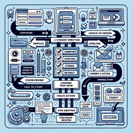
How to Create High-Converting Forms
High-Converting Forms Creation
Understand Your Audience
Before creating a form, it is crucial to understand your target audience…
By gathering insights into your audience’s preferences, you can tailor your form to…
Consider conducting surveys or analyzing data to better understand…
Clear Call-to-Actions
The call-to-action (CTA) buttons on your forms play a significant role…
Make sure your CTAs are clear, concise, and action-oriented to prompt users to take action…
Test different variations of CTAs to see which ones resonate best with your audience…
Mobile-Friendly Design
In today’s mobile-centric world, it is essential to ensure that your forms are optimized for…
Use responsive design principles to make your forms mobile-friendly…
Test your forms on various devices to ensure a seamless user experience across…
Utilize Progressive Profiling
Progressive profiling involves gathering information about users progressively over time…
Instead of overwhelming users with a long form upfront, only ask for essential information…
As users engage more with your brand, you can gradually collect more data to…
Optimizing Form Conversion Rates
A/B Testing
One of the most effective ways to optimize form conversion rates is through A/B testing…
Create multiple versions of your form with variations in design, copy, or CTAs to…
Analyze the results of your A/B tests to identify which elements perform best and…
Streamline Form Fields
To improve conversion rates, it is essential to minimize the number of fields in your forms…
Only ask for information that is absolutely necessary for your business objectives…
Reducing form fields can significantly decrease user friction and increase completion rates…
Implement Auto-Fill Functionality
Auto-fill functionality can enhance the user experience by pre-populating form fields with…
By reducing the effort required from users to fill out forms, you can increase conversion rates…
Ensure that auto-fill features are accurate and compatible with various browsers to…
Visual Hierarchy
Creating a clear visual hierarchy in your forms is essential for guiding users…
Use visual cues such as colors, bold fonts, and spacing to highlight important form elements…
Make sure that the most critical information and CTAs stand out prominently to…
Five FAQs about Creating High-Converting Forms
- 1. What role does user experience play in form conversions?
- User experience is a critical factor that can significantly impact form conversion rates…
- 2. Why is A/B testing important for optimizing form conversion rates?
- A/B testing allows you to experiment with different elements of your forms to identify…
- 3. How can progressive profiling benefit form creation?
- Progressive profiling enables you to gradually gather more information about users over time…
- 4. What are some common pitfalls to avoid when designing forms?
- Common pitfalls to avoid include having too many form fields, using unclear CTAs…
- 5. Why is mobile responsiveness crucial for form design?
- With the increasing use of mobile devices, ensuring that forms are optimized for…
Related Content
- Delight tech-savvy clients with AI chatbots that support your coaching programs in 2025
- The Best Newsletter Ideas for Keeping Your Audience Engaged
- How To Master the Psychology of Color in Marketing
- Incorporate gamified milestone tracking to maintain client momentum throughout 2025
- How to Market Your Coaching Business Using SEO

