How to Optimize Your Call-to-Action Buttons
Section 1: Button Text
One of the crucial elements of a successful call-to-action (CTA) button is the text it displays. The text should be concise, clear, and action-oriented. Avoid using generic phrases like “Click Here” and instead opt for more specific and compelling text that conveys the value or benefit to the user.
Consider using personalized language that resonates with your target audience. Test different variations of button text to see which one performs best in terms of click-through rates. Additionally, ensure that the text is visually prominent and stands out against the background to attract attention.
Section 2: Button Design
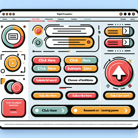
The design of your CTA button plays a significant role in its effectiveness. Make sure the button stands out visually by using contrasting colors that grab the user’s attention. The size of the button should be appropriate – not too small to be overlooked, but not too large to be overwhelming.
Choose a shape that is visually appealing and easy to identify as a clickable element. Rounded corners, drop shadows, or hover effects can make the button more inviting to click. Consider using whitespace effectively to make the button visually distinct from other elements on the page.
Section 3: Button Placement
The placement of your CTA button can impact its visibility and click-through rate. It’s important to position the button where users are most likely to see it without having to scroll. Typically, placing the button above the fold or at the end of compelling content can lead to higher conversion rates.
Avoid placing the button in areas where it might be mistaken for an ad or where it can easily be ignored. Conduct usability testing to determine the optimal placement for your CTA button based on user behavior and engagement metrics.
Section 4: Button Size
The size of your CTA button can influence its clickability and conversion rates. A button that is too small may be overlooked, while a button that is too large can appear intrusive. Strike a balance by choosing a size that is noticeable but not obtrusive.
Consider the device on which the button will be displayed – a larger button may be more suitable for touchscreens to accommodate finger taps, while a smaller button may work better for desktop users. Test different button sizes to determine the optimal dimensions for your CTA button.
Section 5: Button Testing and Optimization
Continuous testing and optimization are key to maximizing the effectiveness of your CTA buttons. A/B testing different button designs, text variations, colors, and placements can provide valuable insights into what resonates best with your audience.
Monitor key metrics such as click-through rates, conversion rates, and bounce rates to evaluate the performance of your CTA buttons. Use the data collected from testing to refine and improve your call-to-action strategies for better results over time.
Related Content
- 6 Surprising Ways to Use Instagram Marketing Tools
- Infuse marketing campaigns with timely, culturally relevant motifs that resonate now
- 5 Things You Should Avoid When Working from Home
- Ingrain brand memory through sensory triggers like color, sound, and style consistency
- How To Integrate Traditional and Digital Marketing for a Comprehensive Approach

