
How to Use Heatmaps to Improve User Experience
Original Top 5 Semantic Keywords Phrases:
- Understanding Heatmaps
- Analyzing User Behavior with Heatmaps
- Identifying Pain Points on Your Website
- Implementing Changes Based on Heatmap Data
- Measuring the Impact of Heatmap-Driven Changes
Understanding Heatmaps
What are Heatmaps?
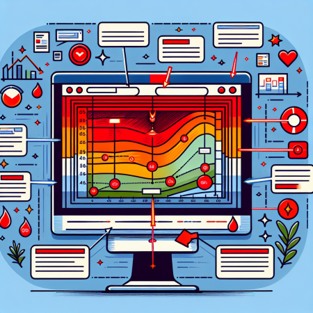
Heatmaps are graphical representations of data where individual values are represented by colors. They are used to visualize the areas of highest and lowest engagement on a webpage. Understanding how users interact with your site can significantly impact your decision-making and optimization efforts.
In essence, a heatmap provides a quick and easy way to understand user behavior patterns. It highlights the ‘hot’ and ‘cold’ spots on your website, showing where users click, scroll, and spend the most time. By analyzing these patterns, you can gain insights into user preferences and areas that need improvement.
Understanding heatmaps is the first step in leveraging this powerful tool to enhance your website’s performance. By knowing the fundamentals, you can better interpret the data and make informed decisions that enhance user experience.
Types of Heatmaps
There are several types of heatmaps, each serving different purposes. Click heatmaps show you where users click the most on your web page. This can help you understand if your call-to-action buttons are effective and if users are engaging with your content as intended.
Scroll heatmaps display how far down the page users scroll. This is particularly useful for long-form content, as it helps identify whether users are reading all the way through or dropping off midway. Understanding scroll behavior can help you optimize the layout and structure of your content.
Hover heatmaps, on the other hand, show you where users move their mouse on the screen. While this data is not as reliable as click or scroll heatmaps, it can still provide valuable insights into how users navigate through your site. In combination, these different types of heatmaps offer a comprehensive view of user behavior.
Benefits of Using Heatmaps
One of the main benefits of using heatmaps is that they provide visual insights into user behavior. This visual representation makes it easier to identify patterns and trends that might not be immediately apparent from raw data alone.
Heatmaps can also help uncover usability issues. For example, if a significant number of users are clicking on a non-clickable element, it indicates a possible point of confusion that needs addressing. By fixing these issues, you can improve the overall user experience and reduce friction on your site.
Moreover, heatmaps are invaluable for A/B testing. By comparing heatmaps of different versions of a webpage, you can see which design or layout performs better in terms of user engagement. This data-driven approach ensures that your website is constantly optimized for maximum effectiveness.
Limitations of Heatmaps
While heatmaps are a powerful tool, they do have limitations. One of the main drawbacks is that they provide a surface-level view of user behavior. Heatmaps show where users click or how far they scroll, but they do not explain why these actions occur. Additional qualitative data is often needed to understand the reasons behind user behavior.
Another limitation is that heatmaps can be misleading if not properly segmented. For example, aggregating data from different user groups can mask important differences in behavior. To get the most accurate insights, it’s essential to segment your heatmap data based on factors like user demographics, device types, and traffic sources.
Furthermore, heatmaps are not a one-size-fits-all solution. Their effectiveness depends on the context and the specific goals of your analysis. While they can provide valuable insights, they should be used in conjunction with other analytical tools for a more comprehensive understanding of user experience.
Analyzing User Behavior with Heatmaps
Interpreting Click Heatmaps
Click heatmaps are perhaps the most straightforward type of heatmap to interpret. Each click is represented by a color, with warmer colors indicating higher levels of engagement. To analyze a click heatmap, start by identifying the areas with the highest concentration of clicks.
These high-click areas often correspond to key elements such as call-to-action buttons, navigation links, or images. If these elements are receiving a lot of clicks, it suggests that they are effective and engaging for your users. Conversely, if important elements are not receiving many clicks, it may indicate a need for repositioning or redesign.
Additionally, pay attention to unexpected click patterns. For instance, if users are clicking on non-interactive elements, it could indicate confusion or misplaced expectations. Addressing these issues can improve user experience and lead to higher conversion rates.
Deciphering Scroll Heatmaps
Scroll heatmaps provide a visual representation of how far down a page users typically scroll. The top of the page is usually the “hottest” area, with colors cooling as you move down the page. To analyze a scroll heatmap, start by noting the average fold line, which indicates the point where most users stop scrolling.
Understanding the scroll behavior helps in determining whether your most important content is placed appropriately. For example, if key information or calls to action are located below the average fold line, they may be missed by a significant portion of your audience.
If you observe sharp drop-offs at specific points, investigate what might be causing users to leave. It could be anything from unengaging content to disruptive elements like pop-ups or ads. By addressing these issues, you can encourage users to scroll further and engage more with your content.
Evaluating Hover Heatmaps
Hover heatmaps track where users move their mouse on the screen. While this data can be less precise than click or scroll data, it still provides valuable insights into user intent and navigation patterns. To analyze a hover heatmap, start by noting the areas with the highest hover concentration.
High hover areas often correspond to elements that users are considering interacting with. These can include hyperlinks, buttons, or even text sections. By understanding which areas attract the most attention, you can optimize these elements to improve engagement and usability.
Also, pay attention to any discrepancies between hover and click data. If users are hovering over elements but not clicking them, it might indicate uncertainty or reluctance to engage. Addressing these issues can help improve user confidence and conversion rates.
Segmenting Heatmap Data
Segmenting heatmap data is crucial for gaining actionable insights. Different user segments (e.g., new vs. returning visitors, mobile vs. desktop users) can exhibit different behaviors, and aggregating this data can mask these differences. Start by segmenting your data based on relevant criteria, such as user demographics, traffic sources, or device types.
For example, mobile users may have different interaction patterns compared to desktop users. By segmenting heatmap data, you can optimize your site for each user group’s unique needs. This targeted approach ensures that your site provides the best possible user experience for all visitors.
Additionally, consider segmenting data by user intent. For instance, first-time visitors may navigate your site differently compared to returning users. By understanding these differences, you can tailor your content and layout to better meet the needs of each group, thereby improving overall user satisfaction.
Identifying Pain Points on Your Website
Spotting High Bounce Rates
Bounce rate is a key metric for identifying pain points on your website. A high bounce rate indicates that users are leaving your site prematurely, which suggests that they are not finding what they are looking for. To identify the causes of high bounce rates, start by analyzing the pages with the highest rates.
Heatmaps can help you understand what might be causing users to leave. For example, if a click heatmap shows that users are clicking on non-clickable elements, it indicates confusion. Similarly, a scroll heatmap with sharp drop-offs suggests that users are not engaged with the content.
By identifying these patterns, you can make targeted changes to reduce confusion and improve engagement. This might involve redesigning certain elements, repositioning content, or improving the overall usability of your site.
Understanding Click Gaps
Click gaps refer to areas of your site where you expect users to click, but they don’t. This can be a significant pain point, as it indicates that users are not interacting with important elements like call-to-action buttons or navigation links. To identify click gaps, start by setting benchmarks for expected click patterns.
Heatmaps can help you identify these gaps. For example, if a key button is not receiving many clicks, it might be due to poor visibility or placement. Similarly, if users are not clicking on navigation links, it could indicate that they are not finding the information they need.
Addressing these issues often involves repositioning or redesigning the elements in question. By making these changes, you can improve user interaction and drive higher engagement rates.
Pinpointing User Frustration
User frustration is a major pain point that can severely impact your website’s performance. This frustration can manifest in various ways, such as rage clicks (repeated clicks in quick succession) or sudden drop-offs. To identify these issues, start by analyzing heatmaps for patterns that indicate user frustration.
Rage clicks are a clear sign of frustration and often occur when users are trying to interact with an unresponsive element. Similarly, sudden drop-offs in scroll heatmaps indicate that users are abruptly leaving the page. These patterns can help you pinpoint the exact elements causing frustration.
Once identified, addressing these issues is crucial. This might involve fixing broken links, improving site speed, or redesigning confusing elements. By resolving these pain points, you can enhance user satisfaction and reduce the likelihood of frustration.
Monitoring Form Interactions
Forms are often essential components of a website, but they can also be significant pain points for users. Analyzing how users interact with your forms can provide valuable insights into potential issues. Start by using heatmaps to identify which form fields receive the most and least interaction.
If certain fields are frequently skipped or abandoned, it might indicate that they are confusing or require too much effort. Similarly, if users are spending a lot of time on specific fields, it suggests that they might be struggling with them. Identifying these issues can help you optimize the form for better user experience.
Additionally, consider analyzing drop-off rates for multi-step forms. If a significant number of users are abandoning the form at a specific step, it indicates a potential pain point. By addressing these issues and simplifying the form process, you can improve form completion rates and overall user satisfaction.
Implementing Changes Based on Heatmap Data
Prioritizing Changes
Once you’ve gathered and analyzed heatmap data, the next step is to prioritize the changes you need to make. Start by identifying the areas with the highest impact on user experience, such as key navigation elements, call-to-action buttons, and critical content sections. Focus on these elements first to achieve the most significant improvements.
Create a list of potential changes and prioritize them based on their expected impact and implementation difficulty. High-impact, low-effort changes should be addressed first, as they offer quick wins for improving user experience. Use the heatmap data to support your prioritization decisions and ensure that you’re focusing on the most critical areas.
Remember that not all changes will have the same impact on user experience. Prioritizing your efforts helps ensure that you’re making the most effective improvements and maximizing the return on your optimization efforts.
Redesigning Key Elements
Redesigning key elements based on heatmap data is a critical step in improving user experience. Start by identifying the elements that are not performing well, such as under-clicked buttons, confusing navigation links, or unengaging content sections. Use the heatmap data to inform your redesign efforts and ensure that the changes are data-driven.
For example, if a click heatmap shows that users are not interacting with a call-to-action button, consider repositioning it for better visibility or redesigning it to make it more attractive. Similarly, if a scroll heatmap indicates that users are not scrolling past a certain point, reevaluate the content layout and structure to encourage deeper engagement.
It’s essential to test the redesigned elements to ensure they perform better than the original versions. Use A/B testing to compare the performance of the new designs with the old ones and make data-driven decisions on which changes to implement permanently.
Improving Content Placement
Content placement is crucial for ensuring that users engage with your website effectively. Heatmap data can provide valuable insights into how users interact with your content and help you optimize its placement for better engagement. Start by analyzing the areas with the highest and lowest levels of interaction.
Use this data to reposition important content elements, such as headlines, images, and call-to-action buttons, in areas with higher engagement. This can help ensure that users see and interact with the most critical parts of your content. Additionally, consider reorganizing your content layout to improve readability and flow.
Improving content placement based on heatmap data can lead to higher user engagement and better overall user experience. Regularly monitor and analyze heatmap data to ensure that your content placement remains optimal and continues to drive user interaction.
Testing and Iterating Changes
Implementing changes based on heatmap data is an ongoing process. It’s essential to continually test and iterate your changes to ensure that they have the desired impact on user experience. Start by implementing small changes and testing their performance through A/B testing or other relevant methods.
Monitor the results and use heatmap data to assess the effectiveness of the changes. If the changes lead to improved user engagement and satisfaction, consider implementing them permanently. If not, iterate on the changes and test new variations to find the most effective solutions.
Regularly reviewing heatmap data and testing changes ensures that your website remains optimized for user experience. This iterative approach helps you stay responsive to user needs and continuously improve your site’s performance.
Measuring the Impact of Heatmap-Driven Changes
Tracking Key Metrics
After implementing changes based on heatmap data, it’s crucial to track key metrics to measure their impact. Start by identifying the most relevant metrics for your goals, such as bounce rate, time on page, conversion rates, and user engagement levels. These metrics provide valuable insights into the overall effectiveness of your changes.
Use web analytics tools to monitor these metrics and compare the data before and after implementing the changes. This will help you determine whether the changes have had a positive impact on user experience and site performance.
Regularly tracking key metrics ensures that your site remains optimized and continues to meet user needs. It also provides valuable data for future optimization efforts and helps you identify areas for further improvement.
Conducting User Surveys
User surveys provide valuable qualitative data that complements heatmap analysis. After implementing heatmap-driven changes, conduct user surveys to gather feedback on the new design and functionality. Use this feedback to gain insights into user satisfaction and identify any remaining pain points.
Design your surveys to be concise and focused, asking specific questions related to the changes you’ve implemented. This will help you gather targeted feedback and avoid overwhelming users with lengthy surveys.
Regularly conducting user surveys ensures that you stay attuned to user needs and preferences. It also provides valuable data for further optimization efforts and helps you maintain a user-centric approach to website design and development.
Running A/B Tests
A/B testing is a powerful method for measuring the impact of heatmap-driven changes. By comparing two versions of a webpage, you can determine which design or layout performs better in terms of user engagement and conversions.
Start by creating two versions of the page, one with the original design and one with the heatmap-driven changes. Use a web analytics tool to split traffic between the two versions and monitor the performance metrics.
Analyze the results to determine which version performs better. If the heatmap-driven changes lead to higher engagement and conversion rates, consider implementing them permanently. If not, iterate on the changes and test new variations to find the most effective solutions.
Evaluating Long-term Impact
Measuring the long-term impact of heatmap-driven changes is essential for ensuring sustained improvements in user experience. Regularly monitor key metrics over an extended period to assess the ongoing effectiveness of the changes.
Compare the data to historical performance to identify trends and patterns. This will help you determine whether the changes have had a lasting positive impact or if further optimization is needed.
Regularly evaluating the long-term impact of your changes ensures that your site remains optimized for user experience and continues to meet user needs. It also provides valuable data for future optimization efforts and helps you maintain a user-centric approach to website design and development.
FAQ
- What are heatmaps used for?
Heatmaps
Related Content
- Why Your SEO Strategy Is Failing (And How to Fix It Today)
- Focus on long-term relationships over quick sales to ensure lasting brand loyalty
- How To Use Effective Storytelling in Your Coaching Sessions
- 7 Proven Marketing Strategies That Drive Results
- Turn data-driven insights into viral website campaigns that thrive in 2025