How to Use Landing Pages to Increase Conversions
Section 1: Designing a Compelling Landing Page
When creating a landing page to increase conversions, it’s crucial to design it in a way that captivates visitors and encourages them to take the desired action. A visually appealing layout with clear and concise messaging is key to engaging users. Use high-quality images or videos that are relevant to your product or service to grab attention quickly. Make sure the page is easy to navigate and the Call-to-Action (CTA) button is prominently displayed.
Another important aspect of the design is to ensure that the landing page is mobile-responsive. With the increasing use of mobile devices, having a responsive design is essential to reach a wider audience. Test the landing page on different devices to ensure it displays properly and provides a seamless user experience across all platforms.
Section 2: Crafting Compelling Headlines and Copy
The headline of your landing page is the first thing visitors will see, so it needs to be attention-grabbing and relevant to the offer. Keep it concise and focus on highlighting the main benefit or value proposition of your product or service. Use power words that evoke emotion and create a sense of urgency to prompt action.
In addition to the headline, the copy on your landing page plays a crucial role in persuading visitors to convert. Clearly communicate the benefits of your offer and address any potential objections. Use bullet points or numbered lists to break up the text and make it easier to read. Keep the language simple and focused on how your product or service can solve the visitor’s problem or meet their needs.
Section 3: Implementing Social Proof and Trust Signals
Adding social proof to your landing page can help build trust with visitors and increase conversions. Testimonials, reviews, case studies, and logos of companies you’ve worked with can all serve as powerful social proof elements. Make sure the social proof is genuine and relevant to your target audience to establish credibility.
Trust signals, such as security badges, certifications, or money-back guarantees, can also reassure visitors that their information is safe and that they can trust your brand. Including trust signals near the CTA button can help alleviate any concerns visitors may have about making a purchase or submitting their information.
Section 4: Optimizing Call-to-Actions (CTAs)
The Call-to-Action (CTA) is the most important element on your landing page as it directs visitors to take the desired action. Make sure the CTA stands out visually by using contrasting colors and a clear, action-oriented message. Use first-person language to make the CTA more personal and persuasive, such as “Start my free trial” or “Get my discount now.”
Placement of the CTA is also crucial. It should be positioned above the fold so that it’s immediately visible without the need to scroll. Test different variations of the CTA button, text, and placement to see which combination drives the highest conversions. Including only one CTA per landing page can help avoid confusion and guide visitors toward the desired action.
Section 5: A/B Testing and Continuous Optimization
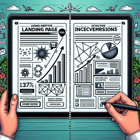
A/B testing is a crucial aspect of optimizing your landing page for conversions. Experiment with different elements such as headlines, copy, images, CTAs, and overall layout to see which variations perform best. Keep track of key metrics like conversion rate, bounce rate, and time on page to evaluate the effectiveness of each test.
Continuous optimization is an ongoing process that involves analyzing data, making data-driven decisions, and implementing changes to improve performance. Regularly monitor the performance of your landing page and make adjustments based on insights gathered from A/B tests and user behavior. By consistently optimizing your landing page, you can maximize conversions and achieve better results over time.

